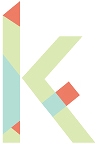
Personally, I'm married to the magnifying glass idea, but I'm trying to incorporate a sense of motion as well.
So far, I've been sticking with San serif styles to convey a sense of modernity, but capitalizing analytics to give authority as well as remaining traditional.
Experiments
Feedback: Response to this post
linear and lowercase, limited angles
Mostly uppercase, with lots of hard angles. I want to distinguish Ress from the other elements. I especially favor the relationship between the R and e in Ress.
I'm liking this new approach of having lots of hard 45 degree angles juxtaposed by the soft curves of the "s"s in the title.
Uniformly lowercase, squared edges or points?
A detailed sketch of an option. This option features overlapping while connecting all letters within the word.


